Generative Art on a Grid
This exercise is a bit of a change-up. I thought it would be fun to occasionally play around with using D3.js to create generative art. In line with the core goals of the site, though, I’ve tried to keep it fairly simple.
The Inspiration
I came across this painting in a building in Charlotte, North Carolina. I’m not sure who the artist is (and please let me know if you know so I can give proper attribution).
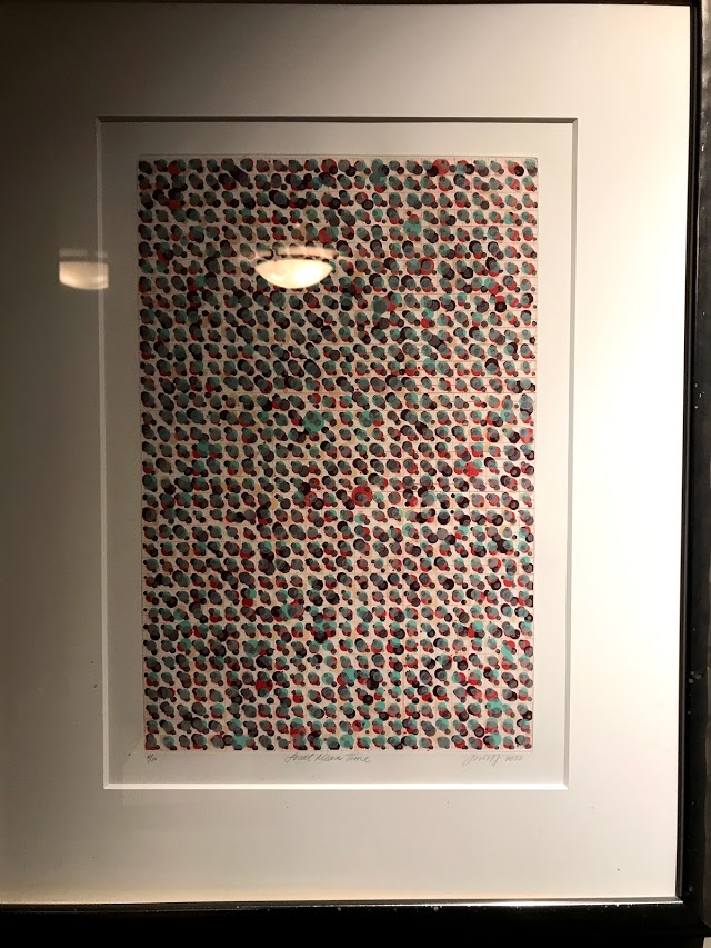
I love the colors and the composition, and I’d be curious to know if the artist used any kind of data or generative system to create it. I think it’s a great inspiration piece for this first generative art exercise.
The Exercise
For this exercise, let’s try to recreate the essential elements of the piece: the grid, the semi-regularly-placed dots of varying sizes, and the color pallette.

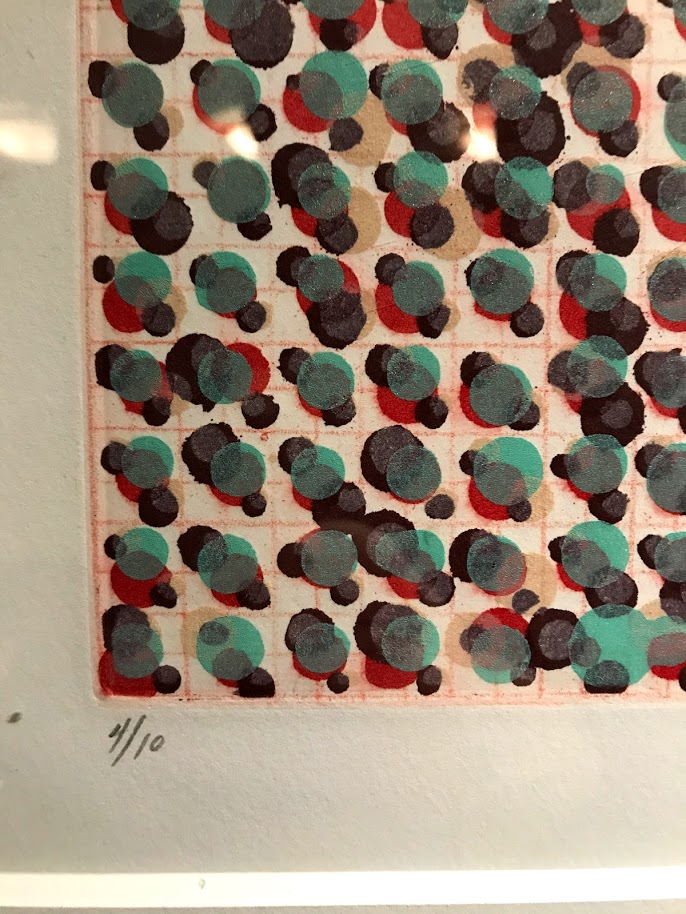
The layout is very similar to a heat map or scatterplot - regularly placed SVG elements along 2 axes. One twist I added is some slight randomization of the positions and sizes of the circles, which is necessary to keep them from all stacking on top of each other.
For the data, we can once again reuse the Raleigh temperature dataset. We don’t need it all, though, so my recommendation is to narrow it down to just the number of data points you need. I’ve laid out the chart on a 12x12 grid, with the 12 months along the X-axis, and an arbitrary selection of 12 sets of years along the Y-axis. Each dot represents a particular month and year, and there are 4 dots per “cell,” so that translates to 4 x 12 = 48 years worth of data we need.
To recreate the color pallette, you can directly sample the colors from the image using a web eyedropper tool like ColorZilla. Colors are assigned as they would be in a heat map, with hotter temperatures getting one end of the color range and cooler temperatures getting the other. I’ve given the circles a little bit of transparency for added texture.
One totally optional feature that gives the result more depth, is an SVG gradient applied to the grid. I used a radial gradient similar to those described on the MDN page on SVG gradients.
A Solution
My solution is below, but I encourage you to attempt it first without peeking. The full code and working example can be found on codepen.
// Initial setup / set margins by convention
const margin = {top: 20, right: 20, bottom: 20, left: 20},
    width = 500 - margin.left - margin.right,
    height = 500 - margin.top - margin.bottom,
    svg = d3.select(".chart")
      .append("svg")
        .attr("width", width + margin.left + margin.right)
        .attr("height", height + margin.top + margin.bottom);

function first48(date) {
  let year = date.getFullYear();
  return (year >= 1900) && (year < 1948);
}

function x(year) {
  let xScale = d3.scaleBand()
  .domain(d3.range(12))
  .range([0, width])
  .padding(0.3);
  // divide 48 years into 12 sets
  let x12 = xScale(year % 12) + (xScale.bandwidth() / 2);
  // add a random offset
  let rand = (Math.random() - 0.5) * xScale.bandwidth();
  return x12 + rand;
}

function y(month) {
  let yScale = d3.scaleBand()
  .domain(d3.range(12))
  .range([0, height])
  .padding(0.5);

  let y12 = yScale(month) + (yScale.bandwidth() / 2);
  let rand = (Math.random() - 0.5) * yScale.bandwidth();
  return y12 + rand;
}

function createGradient(svg) {
   // stroke gradients
  var defs = svg.append("defs");

  var gradient = defs.append("linearGradient")
    .attr("id", "svgGradient")
    .attr("x1", "43%")
    .attr("x2", "67%")
    .attr("y1", "33%")
    .attr("y2", "44%")
    .attr("spreadMethod", "reflect");

  gradient.append("stop")
    .attr('class', 'start')
    .attr("offset", "0%")
    .attr("stop-color", "#AA7B5D")
    .attr("stop-opacity", 1);

  gradient.append("stop")
    .attr('class', 'end')
    .attr("offset", "100%")
    .attr("stop-color", "#F2BFA7")
    .attr("stop-opacity", 1);
}

function createGrid(svg) {
  // create gradient for grid
  createGradient(svg);

  // do grid
  let xGridScale = d3.scaleBand()
    .domain(d3.range(12))
    .range([0, width]);

  svg.append("g")
    .attr('transform', `translate(${margin.left}, ${margin.top})`)
    .attr("class", "xGrid")
    .selectAll("rect")
    .data(d3.range(12))
    .enter()
    .append("rect")
    .attr("width", xGridScale.bandwidth())
    .attr("height", height)
    .attr("x", d => xGridScale(d));

   let yGridScale = d3.scaleBand()
    .domain(d3.range(12))
    .range([0, height]);

  svg.append("g")
    .attr('transform', `translate(${margin.left}, ${margin.top})`)
    .attr("class", "yGrid")
    .selectAll("rect")
    .data(d3.range(12))
    .enter()
    .append("rect")
    .attr("height", yGridScale.bandwidth())
    .attr("width", width)
    .attr("y", d => yGridScale(d));
}

function createColors(d) {
  return d3.scaleQuantize()
    .domain(d3.extent(d, d => d.temp))
    .range(["#AE8057", "#4B876B", "#1C0800", "#650001"]);
}

function createChart(d) {
  createGrid(svg);
  let colors = createColors(d);

  // add circles
  let chart = svg
    .append("g")
      .attr('transform', `translate(${margin.left}, ${margin.top})`);

  chart.selectAll("circle")
    .data(d)
    .join("circle")
      .attr("class", "circle")
      .attr("cx", d => x(d.date.getFullYear()))
      .attr("cy", d => y(d.date.getMonth()))
      .attr("r", () => Math.random() * 9 + 4)
      .attr("fill-opacity", "0.7")
      .attr("fill", d => colors(d.temp));
}

d3.csv( "https://gist.githubusercontent.com/Fil/15e57d2584b618521d173d4c0088d13b/raw/2f7f1a236c074635435cc7ebf9253c20a5681690/data.csv",
  ({date, temp}) => ({date: new Date(date), temp: +temp}))
  .then(d => d.filter(el=>el.temp && first48(el.date)))
  .then(createChart);