Heatmap
The Inspiration
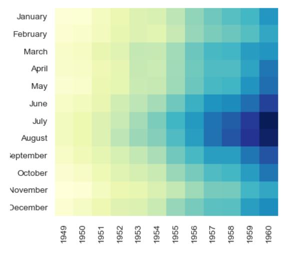
For this exercise, we’ll be creating a crowd favorite data visualization type - the heatmap. The inspiration comes from this example on Stack Overflow, created with Seaborn:
The Exercise
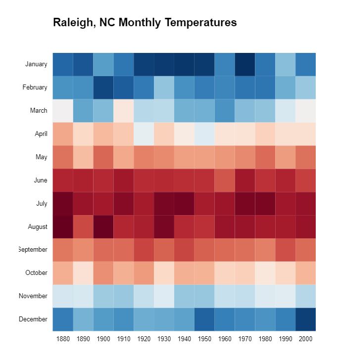
We’ll re-use the historical monthly Raleigh temperature data compiled for a previous exercise, available here. In this case, we don’t necessarily want all the years, so we can filter it down and select, say, one year per decade. We’ll stick with the inspiration’s scales and put the months in the Y axis and years in the X axis. Each square will represent the average temperature for a specific month.
This is mostly a straightforward apply-scales-to-data exercise. However, the data itself can pose a subtle datetime issue to work through. If you’re in the US, you will likely need to use UTC versions of datetime methods, or else the months will be off by 1. The time for each date is midnight on the first day of each month, in UTC, and using standard methods generates local datetimes, which in my time zone is 4-5 hours earlier than midnight, on the previous month. For example, to filter the data to only one year per decade, you can use this function (note the UTC-flavored method):
function isDecade(date) {
  return date.getUTCFullYear() % 10 === 0;
}
A Solution
My result looks like so:
My final JavaScript code is below, but I encourage you to try it yourself.
d3.csv( "https://gist.githubusercontent.com/Fil/15e57d2584b618521d173d4c0088d13b/raw/2f7f1a236c074635435cc7ebf9253c20a5681690/data.csv",
({date, temp}) => ({date: new Date(date), temp: +temp})
).then(d => d.filter(el=>el.temp && isDecade(el.date)))
.then(createChart);

// Filter data to one year per decade
function isDecade(date) {
  return date.getUTCFullYear() % 10 === 0;
}

function createChart(d) {
  // set margins by convention
  const margin = {top: 20, right: 20, bottom: 30, left: 55},
      width = 500 - margin.left - margin.right,
      height = 500 - margin.top - margin.bottom;

  var chart = d3.select(".chart")
    .append("svg")
      .attr("width", width + margin.left + margin.right)
      .attr("height", height + margin.top + margin.bottom)
    .append("g")
      .attr("transform", `translate(${margin.left},${margin.top})`);

  let years = d.map(el=>el.date.getUTCFullYear()),
      temps = d.map(el=>el.temp);

  let yearRange = d3.extent(d, d => d.date.getUTCFullYear());

  let x = d3.scaleBand()
    .domain(d3.range(...yearRange, 10))
    .range([0, width]);

  let y = d3.scaleBand()
    .domain(d3.range(12))
    .range([0, height]);

  let colors = d3.scaleSequential(d3.interpolateRdBu)
    .domain(d3.extent(d, d => d.temp).reverse());

  chart.selectAll("rect")
    .data(d)
    .enter()
    .append("rect")
    .attr("class", "rect")
    .attr("x", d => x(d.date.getUTCFullYear()))
    .attr("y", d => y(d.date.getUTCMonth()))
    .attr("width", x.bandwidth())
    .attr("height", y.bandwidth())
    .attr("fill", d => colors(d.temp));

  // add axes
  const formatMonth = d3.timeFormat("%B");

  let yAxis = d3.axisLeft(y)
    .tickFormat((d) => formatMonth(new Date(2000, d, 1)));

  chart.append("g")
    .call(yAxis);

  let xAxis = d3.axisBottom(x);

  chart.append("g")
    .attr("transform", `translate(0,${height})`)
    .call(xAxis);
}
Complete code and a working example are available on codepen.